Project completed as part of the interview process at Cath Kidston, a British accessories, homewares and fashion store with a focus on handicrafts and vintage themes.
IDEATION – BRANDING – LOGO DESIGN
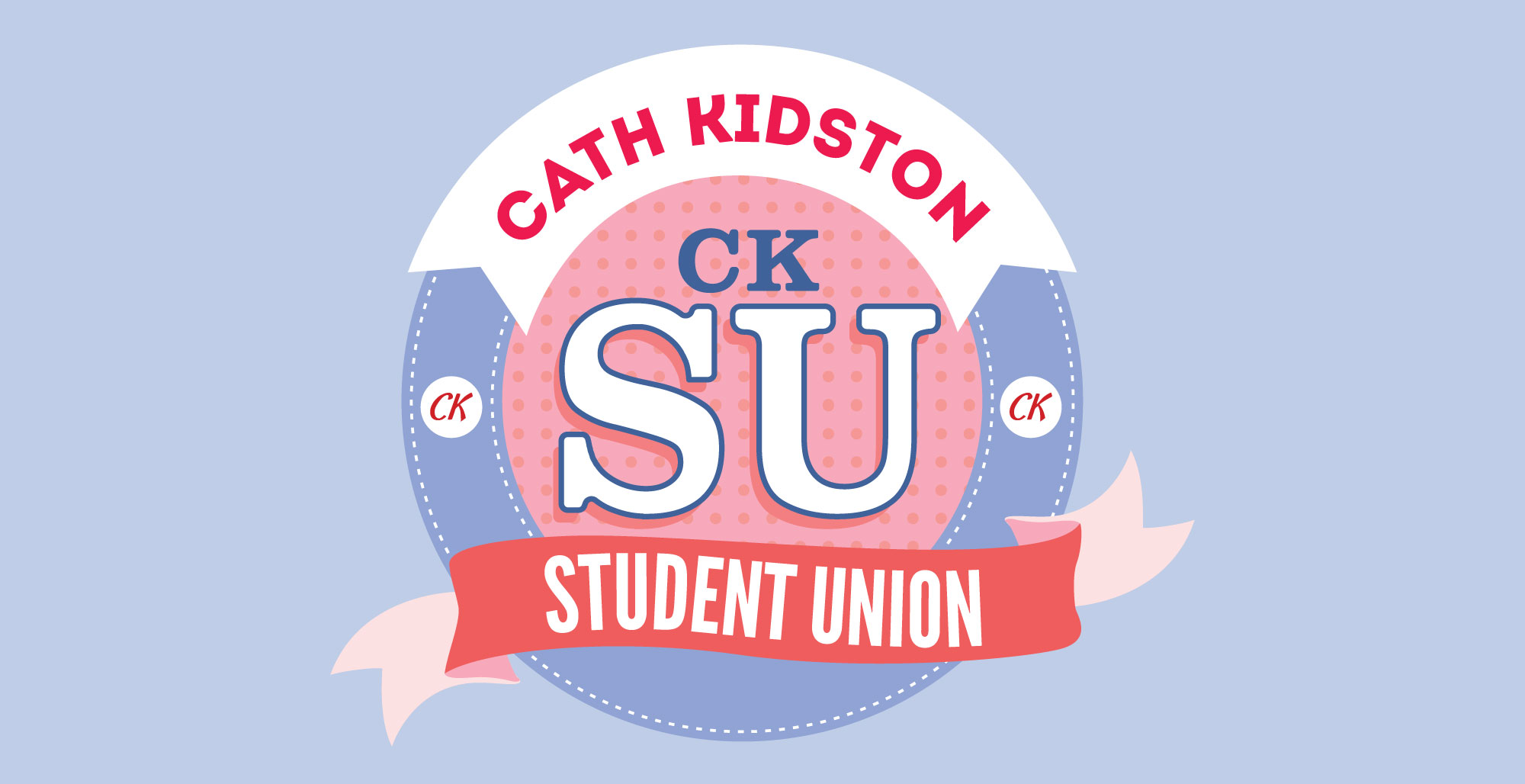
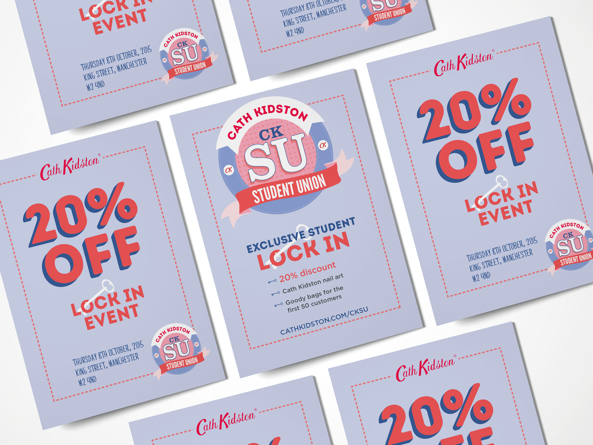
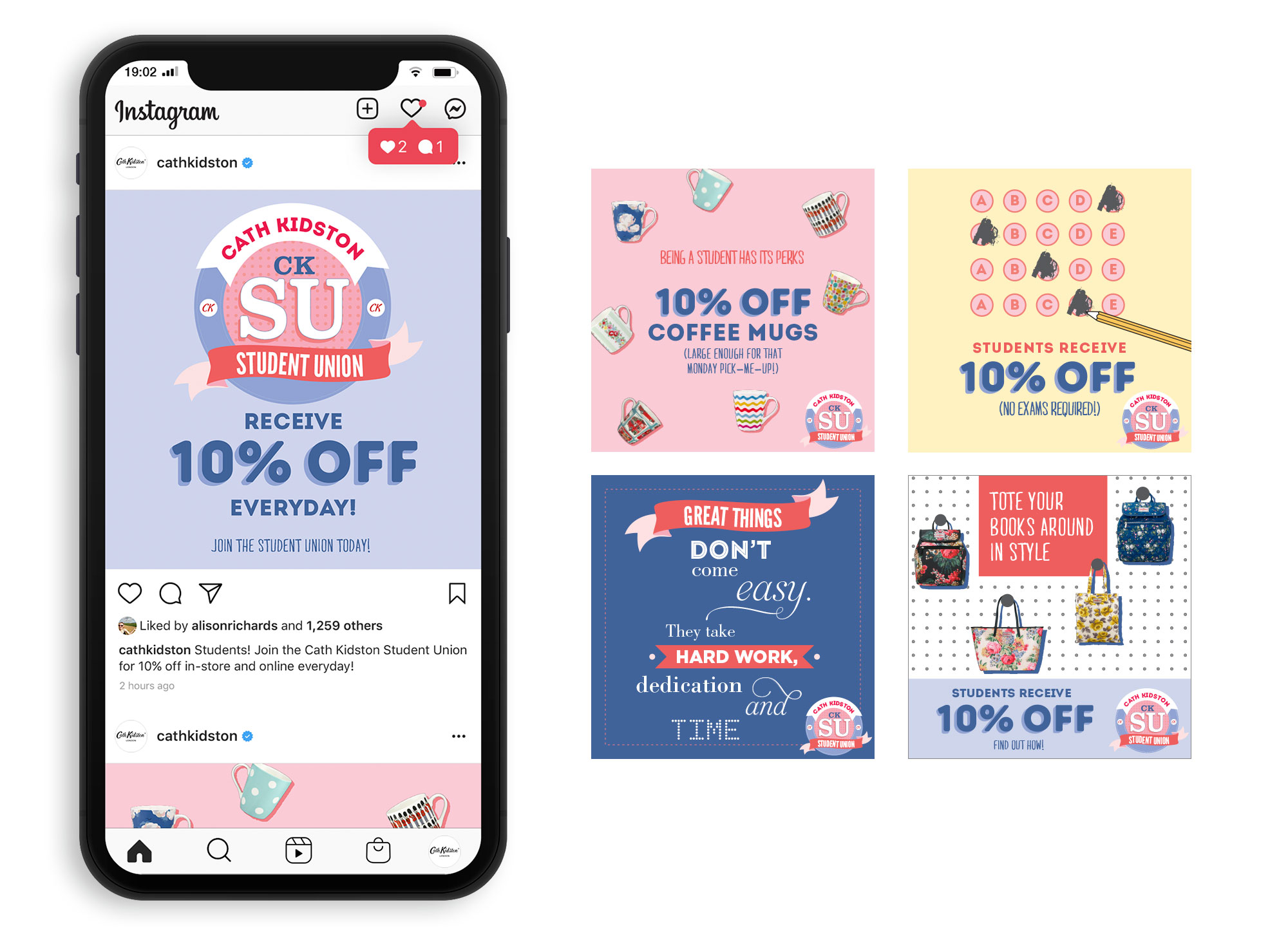
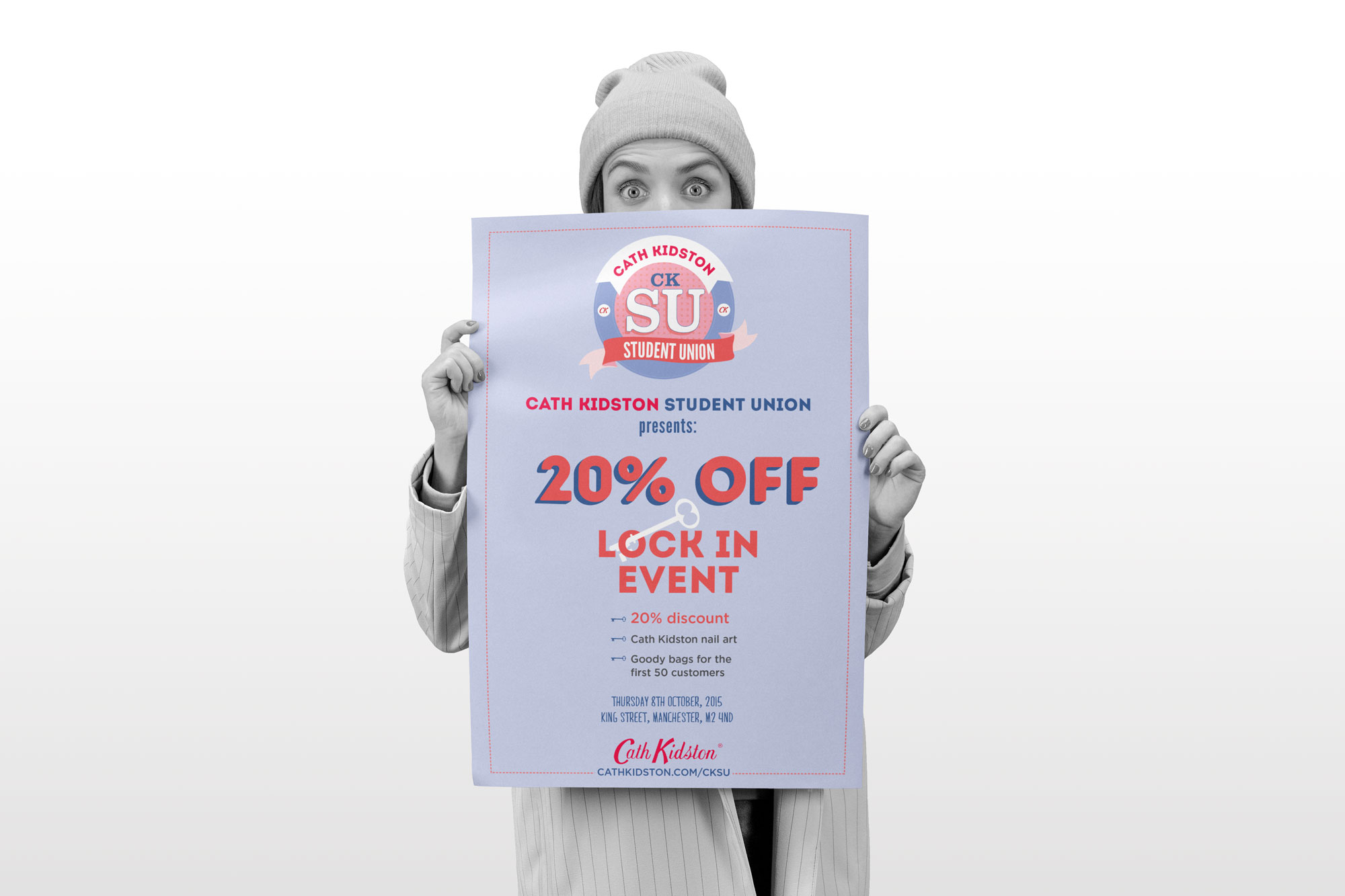
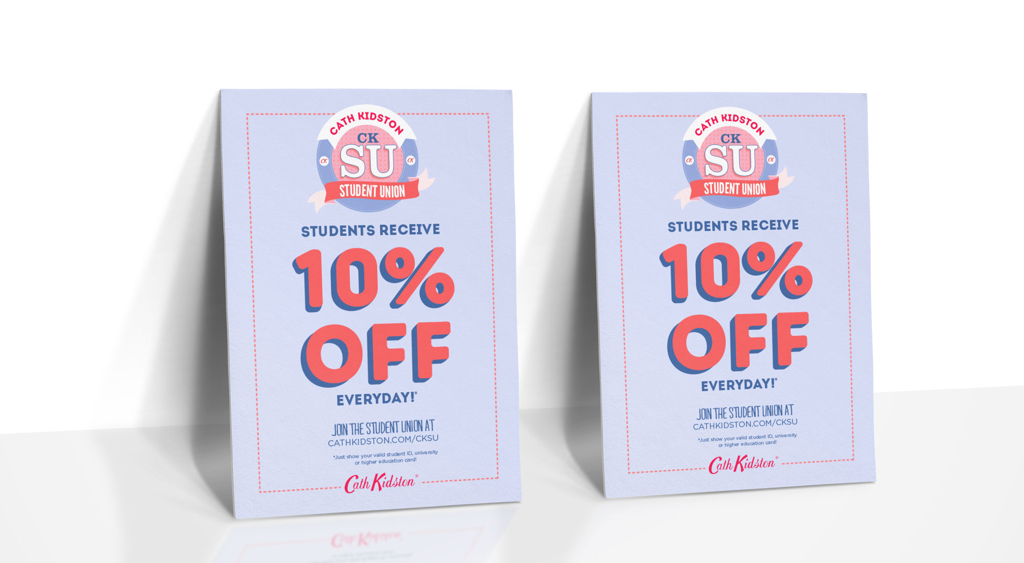
I interviewed for a design job at Cath Kidston. As part of the process, we had to develop a series of collateral to be used for the new promotion for students - a logo, an A6 flyer, a single use discount card, A3 poster, window vinyl, web banners and social media assets.
I was just pipped to the post by the successful candidate, but did really enjoy the project.
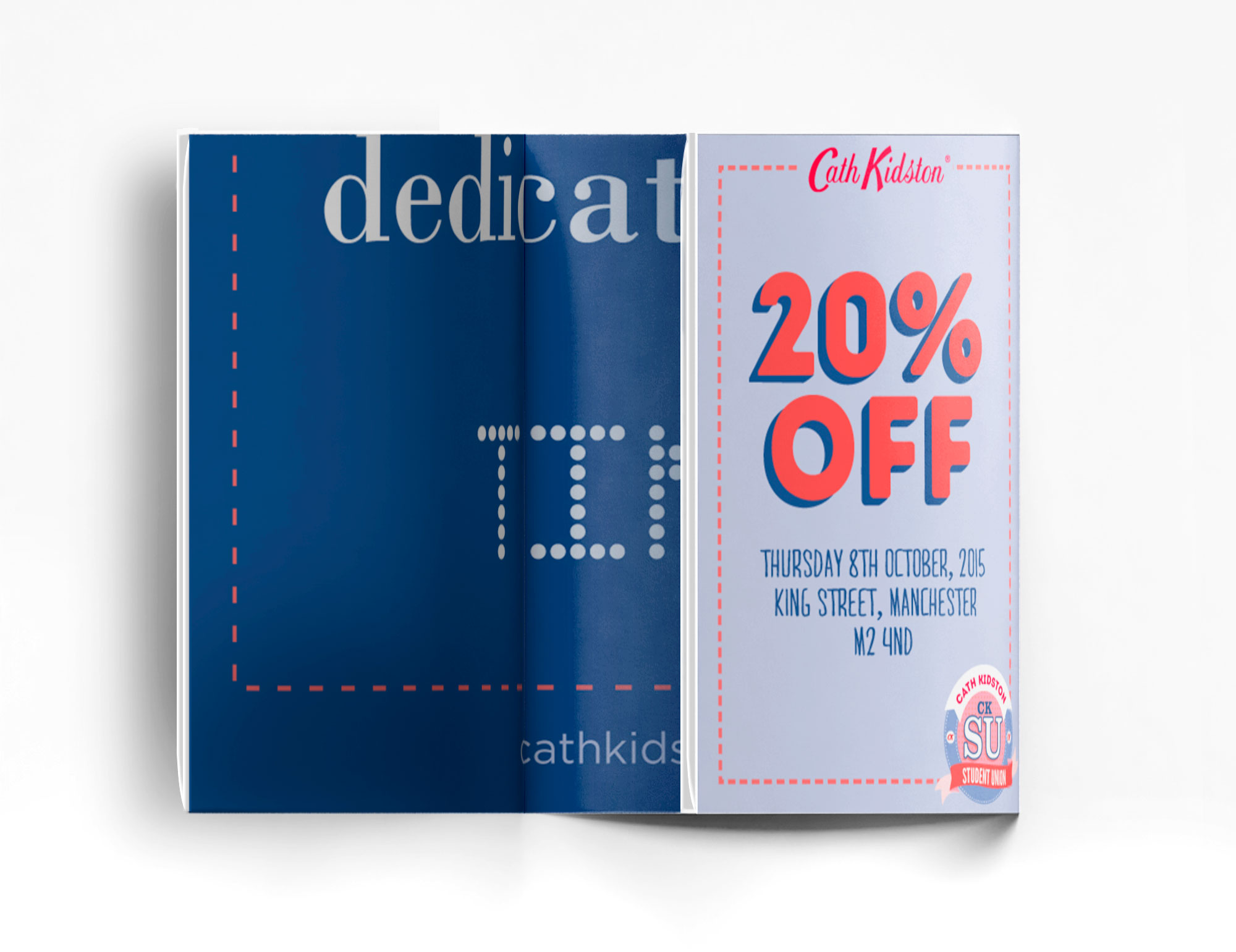
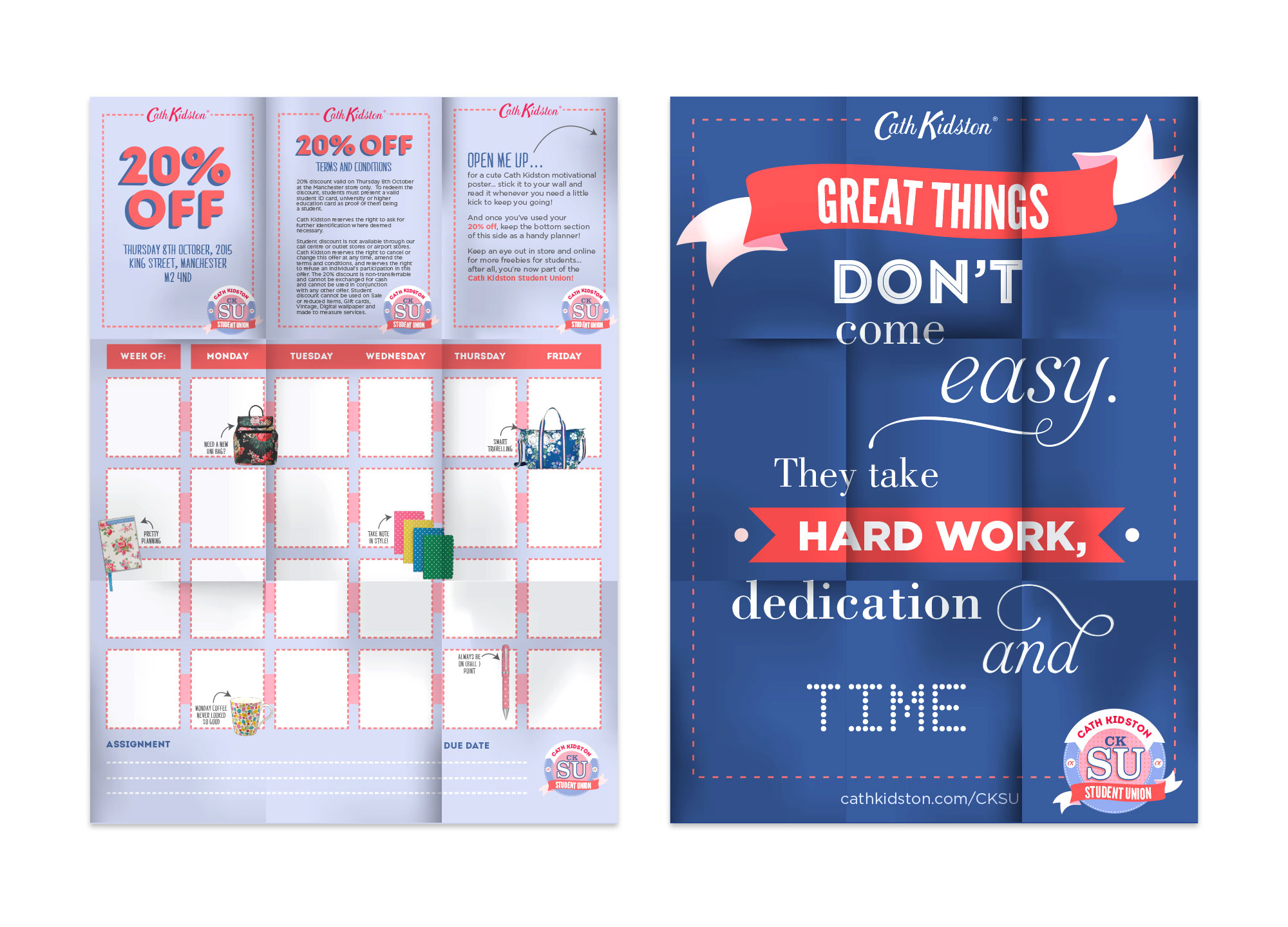
The expanding discount card is a folded A7 card, which is glued to a larger sheet of paper that folds into the card. When opened, the folded page reveals a motivational poster on one side, and a small planner on the other.
The reasoning behind the card was that instead of creating something for students that they would use and throw away (or simply throw away), I would create something that they would want to keep and would have a greater lifespan than a simple card. By holding onto and possibly displaying the poster, Cath Kidston would be at the front of mind of students looking to buy school supplies.
Another logo was created for the “Lock In” collateral (A6 flyer and A3 poster) using a vintage key, a nod to the vintage styling of Cath Kidston.
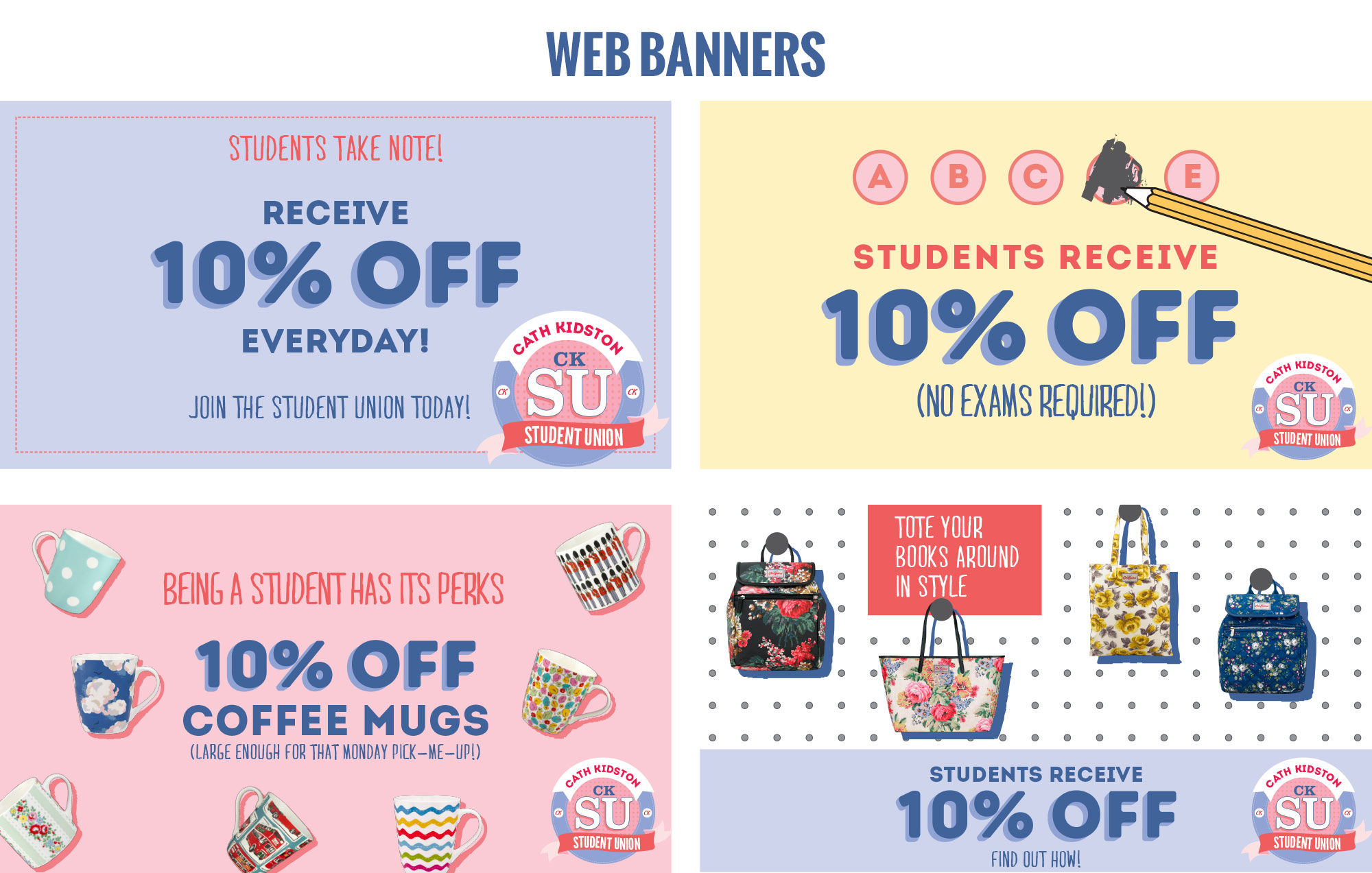
Social media and website banners followed the same artwork as the CKSU collateral, with the addition of student-specific artwork, highlighting useful products for school and uni students.
